Introduction
GW will be bringing out a boxed set in 2020, along with several brand new teams and updated rules, which means it is a perfect time to look at the painting section of the hobby. There are already numerous resources devoted to the best techniques employed for painting models, these will apply just as well to Blood Bowl players as they would for any other gaming model. Therefore, the focus of this article will be on an aspect where Blood Bowl differs from most other miniature games, picking the colouring of sports uniforms.
When it comes to painting models a key factor to take into consideration is the colour scheme that you will use. Much of the time the models will be viewed at arm’s length or greater. At this distance there will be little to differentiate between the technique of an average painter and that of an expert. A basic paint job will pretty much always look better than bare plastic, metal or resin.
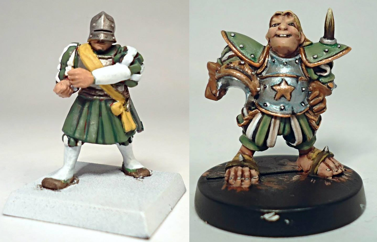
The model on the left was done using basic painting techniques, washes and drybrushing over a basecoat. Whilst the model on the right was completed to a higher standard. The differences are clear up close up in a well-lit photograph.
Most of the time the view above is what will be seen of the models. In a real life situation, with both models on the pitch and a distance from the viewer, the differences in quality of painting are much less clear.
No matter how good your technical painting abilities are, a bad choice of colours can really detract from the overall look of the team. Leaving them as a disjointed bunch of individual models compared to a cohesive group of skilled athletes. Conversely it is achievable to have a team that will look great on the board by applying a minimum of time and ability and using the right selection of colours along with the application of simple painting methods.
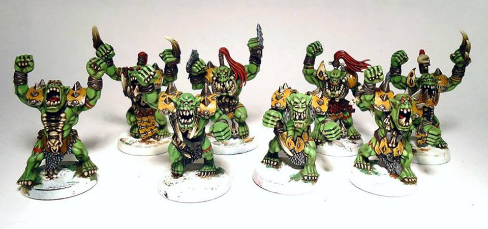
In this example the model on the left has had basic painting techniques used and a simple and limited paint scheme of yellow, black, cream and silver. In contrast the model on the right was painted to a higher technical standard but given a garish and disjointed colour scheme. It is surprisingly difficult to create a bad scheme using bright colours. The first version of this model looked too nice and I had to go overboard with the decoration. Even then, this kind of scheme can be used to deliberate effect on some players, followers of chaos or Snotlings being prime examples.
Schemes based on other models
A very simple option is to copy colours from actual bloodbowl teams. A lot has been published about Blood Bowl, both online and in paper form and much of this focused on specific teams, giving their history, playing style and colour schemes. You can just google the team name to find illustrations or pictures.
If you don’t want to create an exact copy of a famous team another option would be to look at schemes used on other blood bowl teams. A quick search should bring up plenty of options for each race and you can copy or adapt those. You don’t have to only look at schemes used on the same race, colours used for high elves may well suit a more clean cut human team whilst those used on orcs might be appropriate for more rowdy humans. Alternatively, an undead, Khemri or necro team could be made up of a dead players from a team you liked the look of.
The next option is to look at fantasy or sci fi models that you like. This can be a good solution as you can see how well these work painted onto 28mm scale models. Most of the Blood Bowl races have a fantasy equivalent and quite a few have sci-fi versions too. You don’t need to just limit yourself to the races closest to your own team though. Heraldry used on knights can be a good source of inspiration as they have rules based on what colours to use and you can even get ideas for the team logo. Plenty of contemporary or sci fi models have brightly coloured outfits or armour and these are a good source of ideas too.
Certain colours are most commonly associated with some races, such as white and blue for high elves, black, gold and red for chaos dwarfs and green or brown with nurgle. Looking up well painted dark elves, space Orks or humans online can be a good place to get colour schemes from. Of course you can deliberately choose a colour not normally associated with that race, black and red wood elves may be out for blood vengeance on some dwarfs who killed their star treeman with a flame cannon secret weapon or a team’s uniform that were once pristine and white has now become soiled after they were infected with nurgle’s rot and that can make them appear even more repulsive.
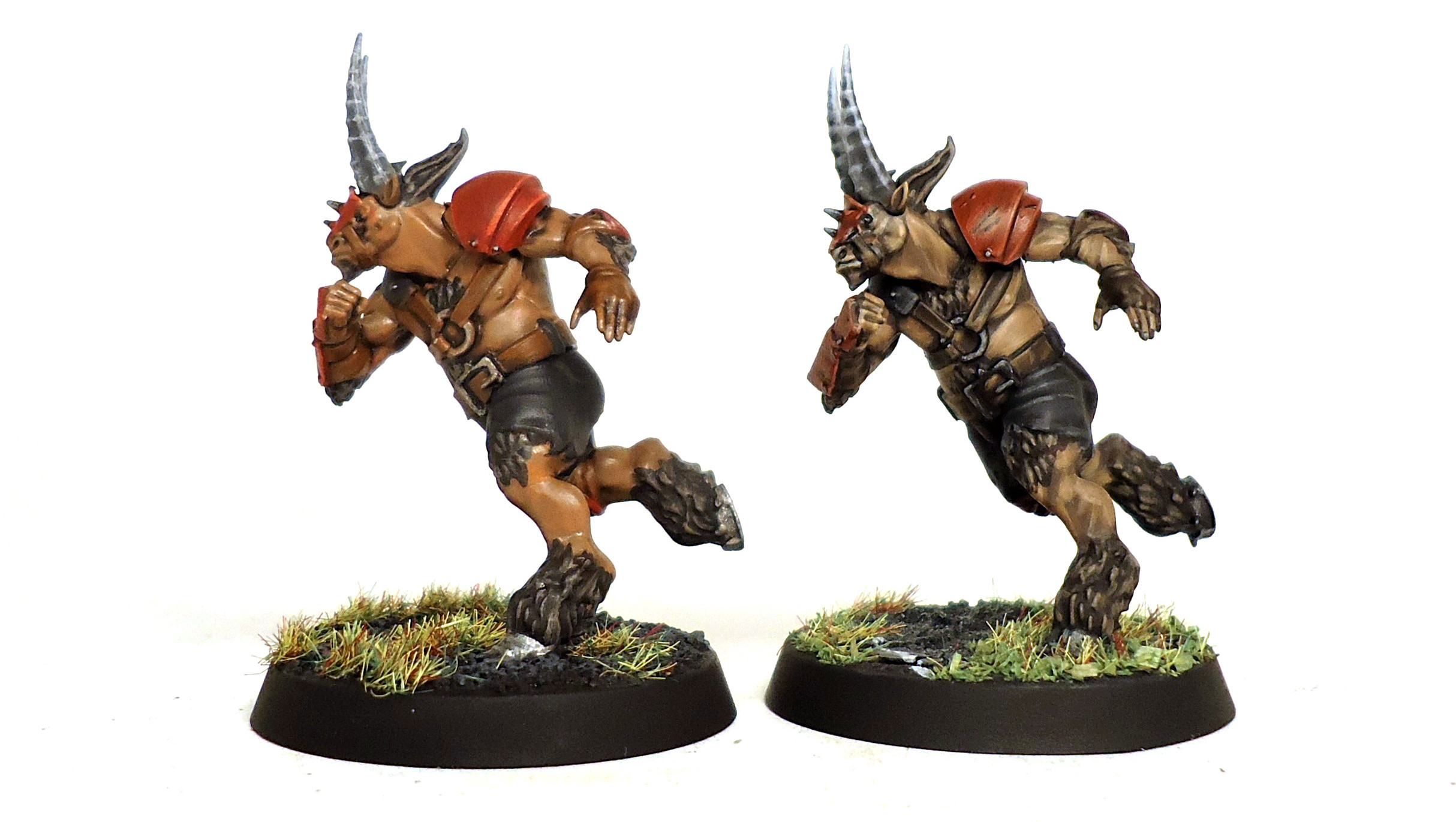
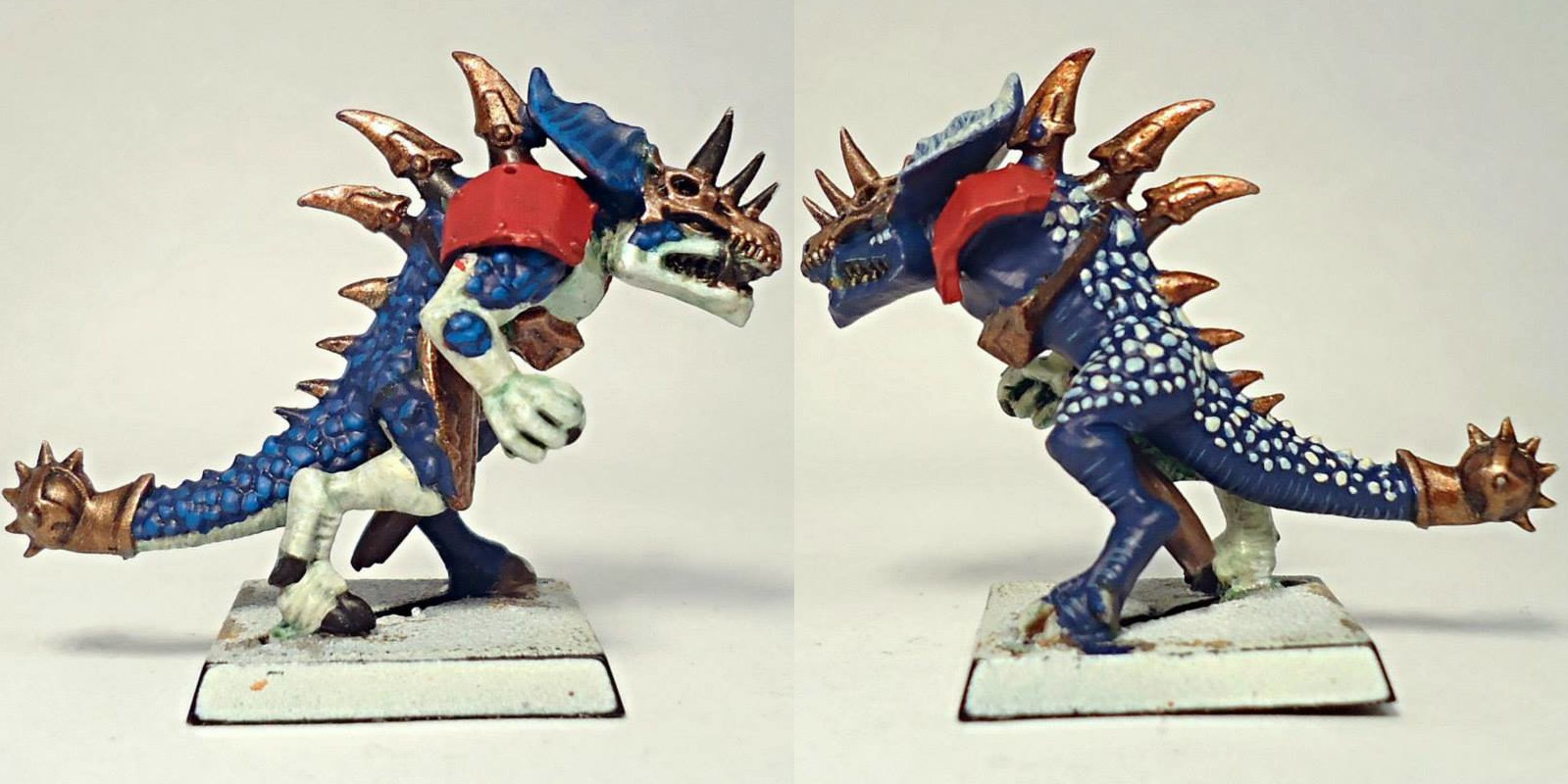
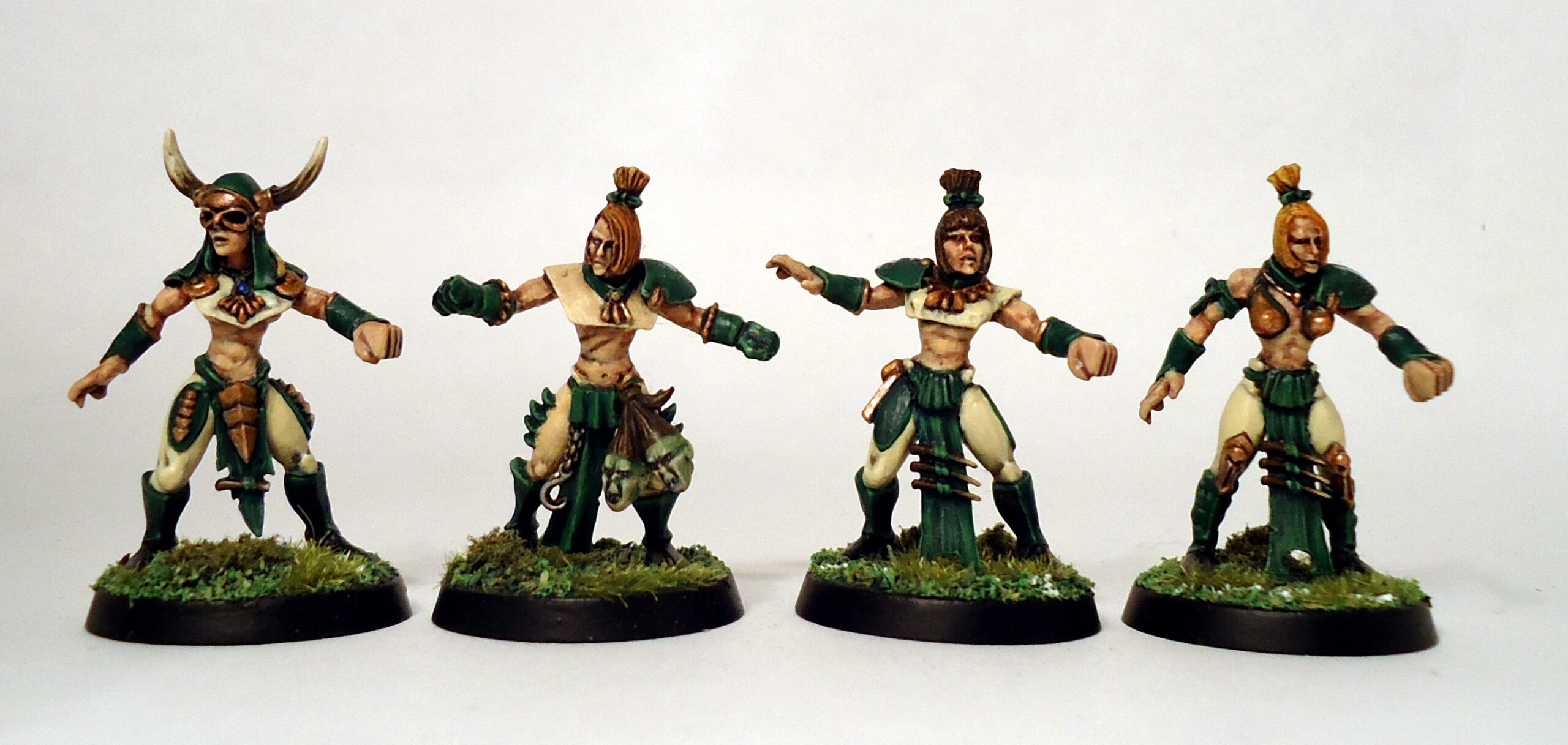
Classic nurgle green was used for the skin of these pestigors, as a contrast their team strip was purple armour with white cloth and silver metallic parts. This works well with the green skin, though not very “realistic” for the team.
With them being followers of nurgle the lower picture shows that their equipment is far from pristine, the armour is badly damaged, the metal rusty and the clothing heavily stained.
Taking Inspiration from real world sports
The Bloodbowl source material is littered with references and puns of existing sports teams (such as the Orcland Raiders) and this is a great place to start. American football is ideal, since many Blood Bowl models wear similar looking armour with added spikes, but other sports are equally good sources of inspiration. Often non-team sports such as F1 racing, horse racing or athletics can prove to be an unexpected source of inspiration.
You can lift them straight from these teams or make changes, switching the colours round or taking patterns from other strips and incorporating them into your design. Some colour schemes are associated with certain teams, such as the black kit and silver fern of the All Blacks New Zealand rugby team, blue and red striped top of Barcelona FC or the stars and stripes of the Harlem Globetrotters. In that case a team can be themed after your favourite sporting team, maybe even using player the actual player names or puns based on them (Shaquille Orc’Neal or Ratnaldo) . If you like the strip but don’t necessarily wish to be associated with a real-world team then switching some of the colours about will get round this. Away strips are a useful source of colour schemes if you don’t want to be associated with a specific team. The great thing about them is that they often change drastically over the years and will be unknown to all but the most devoted fans, giving even more of a chance of finding a scheme you like.
Most team uniforms are pretty simple, red shirts, white shorts and some black areas for decoration such as socks; in some cases they will have designs or patterns such as stripes, spots, checks or borders. The fundamentals of these strips tend to stay pretty consistent over the years, though there are often small changes and additions such as borders, colour swaps of minor parts or extra decoration. If you are feeling ambitious then you could paint some of these types of extra decoration, maybe copying the exact strip from a championship winning season. Alternatively the additions themselves can be used to add interest to a plain shirt or shorts, maybe even giving positionals small differences to mark them out.
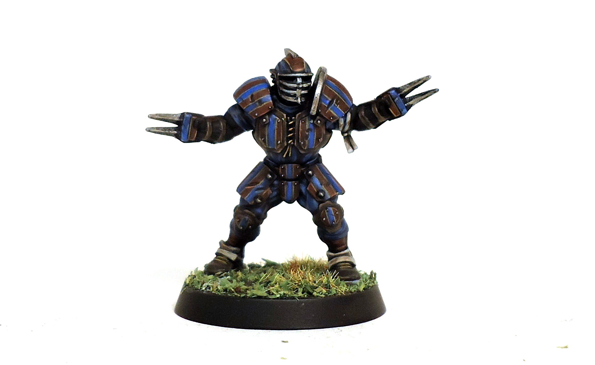
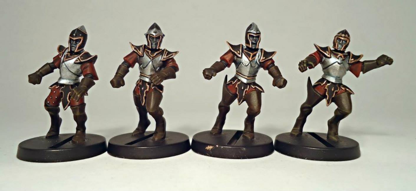
The classic red and blue vertical stripes with yellow details from the Barcelona FC kit was copied for this human lineman.
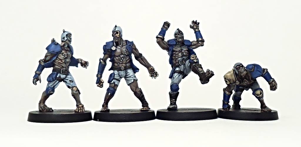
This undead team based their strip on the older strip of the Seattle Seahawks, with blue shirts and armour along with silver grey helmets and trousers. Any metallic parts such as spikes or armour edges were painted rusty silver.
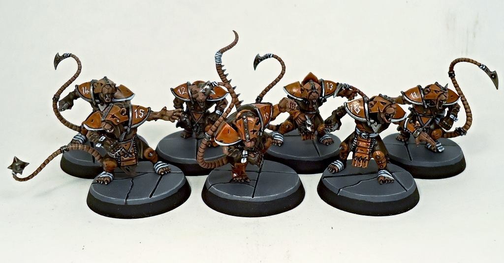 This skaven team had a strip loosely based on the Cleveland Browns uniform. Their colours are orange, brown and white, so their clothing and armour reflects this. All armour pieces were painted orange, clothing was mostly brown with small areas of white as a contrast. They don’t copy any particular strip, just uses the colouring. Being skaven the orange used was a slightly dirtier brown as they are not know for their cleanliness.
Other real-world inspiration.
There is no need to limit your colour scheme inspirations to just the realm of sports, all sorts of things have multiple bright colours that can be used for Blood Bowl teams. Flags, logos and packaging can all be used, companies spend huge amounts of money to determine what kind of packaging will most appeal to consumers, so you can make use if that with your teams.
Just looking at products in a supermarket, clothing and accessories in shops or a browse through a natural history book/website can trigger off all sorts of ideas. Even something like a sunset with the mixture of pale blue sky, dark grey clouds and orange sun can bring inspiration.
This chaos team has a black, gold and cream strip, these are the same colours as those used by the Oil of Olay beauty range. As just because you are a dangerous psychopath dedicated to the ruinous powers doesn’t mean you can’t have beautiful skin.
Colour theory
This is quite a complex subject so will just be lightly touched on. There are many sources of information online going into great detail on this subject and quite a few that pertain to model painting in particular.
Colours are often grouped into “families” of similar looking colours, such as warm (red, orange, yellow and gold) or cold (blue, grey, silver and white). Green, grey and purple are often counted in one or the other but can be either such as purples with a lot of blue can be cold or greens with a lot of yellow can appear warmer. You also find other groups such as “natural” colours (green, brown and warm greys) or “neutral” (browns and greys) or “pastels” (lighter versions of strong colours, ideal for slaanesh or haflings).
These families can be used to increase the number of colours used on a model without overloading it. A team with a red, orange and yellow strip with gold armour uses quite similar colours in contrast to a player with; blue, yellow and red strip with silver armour. You can use this to your advantage as it allows more colours to be used without overloading the model.
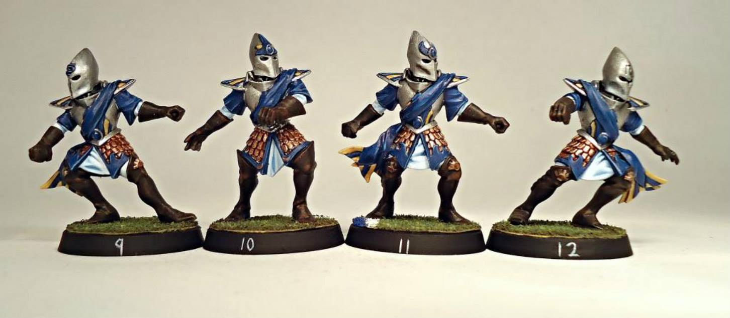
This team has blue, yellow, silver, white, gold and brown for their strip, a total of 6 colours. However as yellow and gold are close as are white and silver this does not overload the model. Had green and red been used instead of yellow and white it would have looked too busy. These are linemen and red or green could be used in moderation on the positionals.
Similarly looking at the colour wheel for which colours are close to each other will show the colours that are analogous to each other such as yellow, pale green and green. Conversely those colours opposite each other on the wheel are known as complementary such as yellow and purple.
Having too many analogous colours risks the model appearing dull and samey, on the other hand too much complementary colours will leave them garish and chaotic. Both of these outcomes can be desirable depending on the race, a very decayed undead team might suit dull colours whilst a Tzeentch themed chaos team may have a lurid, headache inducing scheme.
On top of this adding white, black or grey will give different tints, shades and tones opening up even more possible combinations.
How colours interact with each other is an important consideration and can help draw the eye to certain areas such as the model’s face, team badge or player numbers.
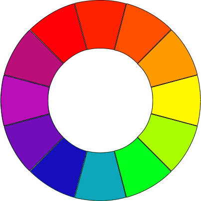
A simple 12 colour wheel, showing which are complimentary and contrasting.
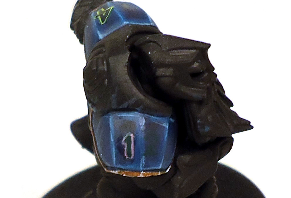
The one on purple 14 or two on the dark green 12 numbering on a dark blue shoulder pad are very difficult to see, since they are so close to each other. A lime green border on the 4 and a pink on the 1 was used to show how different the number look with this contrast.
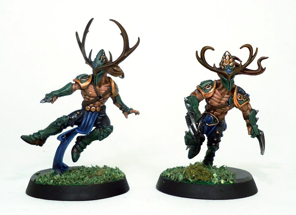
These players use muted greys, browns and silver all of a similar analogous and natural appearance, ideal for a wood elf team. The small areas of blue stand out as a contrast and highlight the otherworldly aspect of the team. The idea being that this player is somewhere between a daemonette and a dryad.
Test Models
Starting work on a team is a pretty daunting business, once you have carefully cleaned up your brand new purchase, applying paint is a big step. Paint can be removed, or mistakes covered up but it requires effort and can deflate motivation if initial attempts do not turn out as hoped.
One way to limit this is to make up a simple test model to try out colour schemes and techniques on. That way you can get an impression of how the colours will look without risking one of your existing players.
As this is a just a way to experiment with colour schemes then the model itself doesn’t have to be an exact match for the team. Sometimes you’ll have spare bits left over from conversions or a model that might be quite different but has a similar clothing/armour type you can use as a substitute. To save time you can paint half the model in 1 scheme with a different scheme on the other side.
Once you have decided on the final colour scheme you can paint that on a single model, usually the 0-16 choice to iron out any final details before you get really stuck into the full squad.
This model was made from spare parts leftover from the other lizardman players. 2 different schemes at once can be tried out by painting just the left or right side of the model.
As long as the test model has roughly similar clothing/armour to the team it can be sufficient to give an accurate impression of how a colour scheme will turn out. This human was made from spare empire parts as he had a similar amount of armour to the flings and ruffles on some of his clothing like they did. Despite him being far too large to pass as a Halfling this model is still close enough for trying out schemes.
3 Colours minimum
A common painting stipulation for tournaments is that all teams must be painted with a minimum of 3 colours. This technique begins with that stipulation and expands on it to create simple and effective colour schemes. I have always preferred a limited colour palette when painting Bloodbowl players, if you look at sports kits then they tend to avoid mixing too many colours as the idea is to allow fans and officials to easily distinguish between the 2 teams. I also feel that using a lot of colours can overload the model.
I have a pretty simple and robust system I often use when I don’t have a specific colour scheme in mind, it is designed to handle the diverse array of armour and player types available in the game.
It begins with 3 categories; colours, shades and metals.
Colours
These are the 3 primary colours of paint along with green and assume a bright version as the starting point.
- Red, Blue, Green and Yellow
Shades/Neutrals
The shades are there to contrast with the colours and cream is thrown in to open up more options since white is often hard to paint or a little harsh.
- White, Black and Bone/Cream
Metals
Metallic colours are usually needed for things like armour and spikes that adorn most Blood Bowl models as well as decoration. These can be painted in the NMM technique (Non-metallic metallic) using colours or shades, but this is difficult to get right especially for silver.
- Gold and Silver
Then it is just a case of picking 1 from each category, usually the primary part of the uniform (shirt and/or shoulder pads) uses the colour with the shade being secondary (shorts, socks or accessories) and the metal used for the metallic bits like, spikes, studs, decoration and chainmail pieces.
In this example above we have Wood Elves wearing green armour with gold edging and black clothing. Minor details like the studs and spikes are silver and the gems and loincloths are blue.
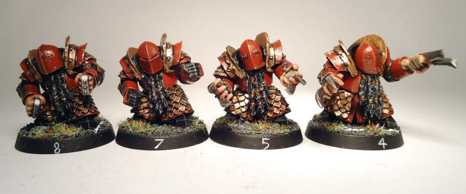
These Chaos Dwarfs have primarily red armour with gold scales and edging and black details. Again small details like studs, claws and knuckle dusters are painted silver.
Using this method, you can very easily end up with a simple and pleasing colour scheme. A potential difficulty would be using both yellow and gold in the same uniform as they are quite similar, in this case it is wise to have either a large amount of the shade as contrast and/or just a very small amount of gold or yellow.
More Options
If this list above is too restrictive then you can start adding some or all of the following:
Colours
- Maroon, Pink, Purple, Orange, Turquoise/Teal, light/dark Green or Blue
Shades/Neutrals
- Grey and Brown
Metals
- Bronze, Copper
Metallic colours are an option too and they can be put in either the colour or metal category.
These extra options give a lot more variety but also greatly increase the risk of picking some colours that clash or are too similar. Bear in mind the metallic colours may well look a lot like their normal counterpart, even gold and silver are effectively shiny yellow and grey respectively.
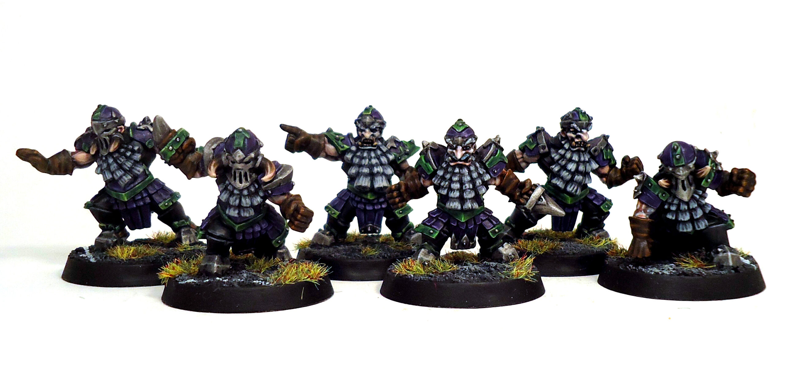
A chaos dwarf team was given a very different scheme from the usual black/red/gold as can be seen above. They had purple as the main colour with silver for metal, with the addition of a bright green painted in a NMM style for some metal parts.
Non-uniform colours
There is a high likelihood your model will have lots of extra bits that may not really part of the uniform such as boots, gloves, belts and other decorations. These can be painted in the team colours, something neutral like mid brown or a 4th team colour can be added. This is a good opportunity to experiment with something that differentiates from the rest of the strip. A purple shoulder pad with yellow spots or stripes may look a bit garish (that can be a good thing for some teams), but the same purple pad with a small yellow border or the player’s number on it will really stand out.
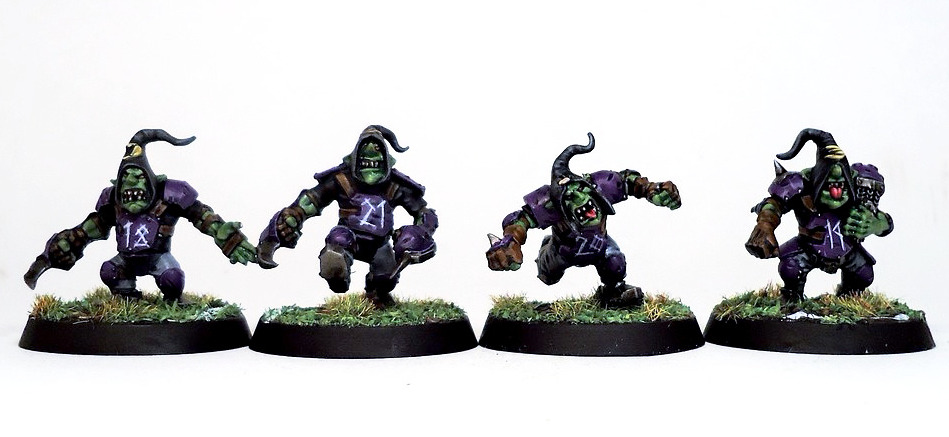
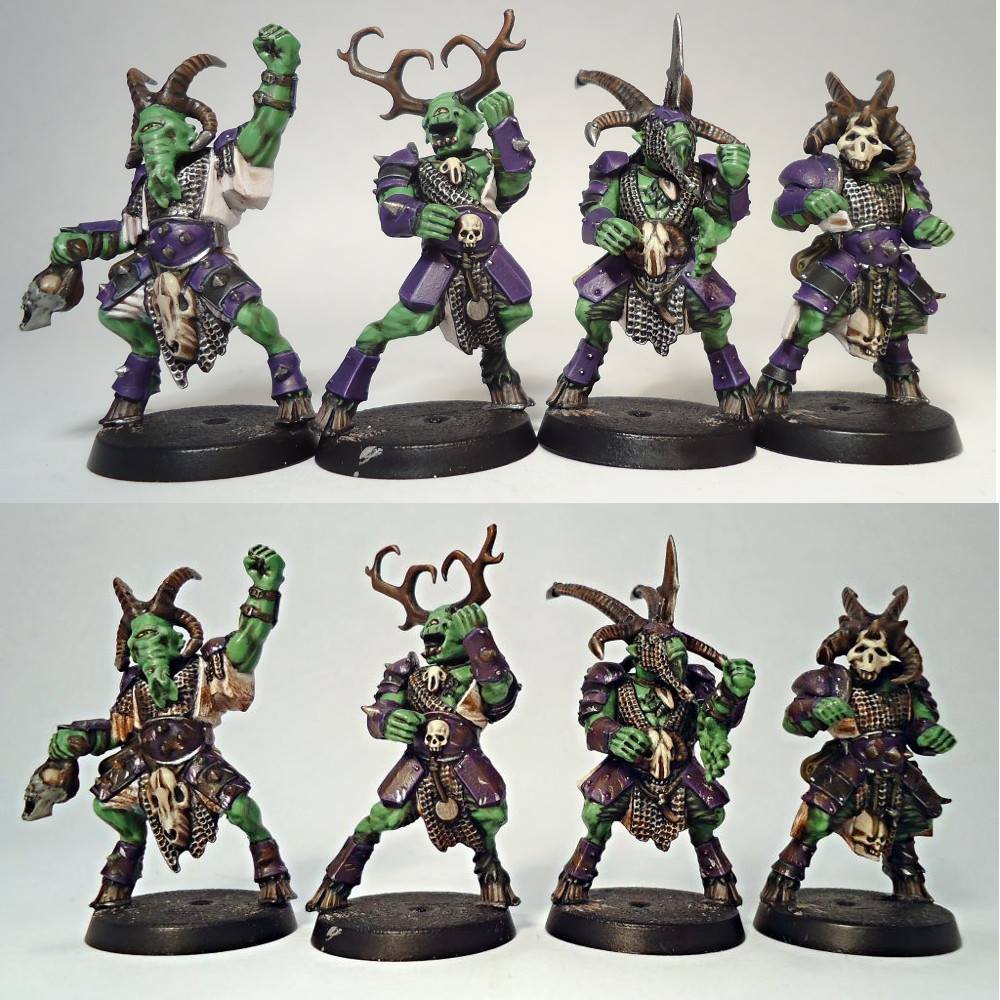
The goblins have a strip that consists of black top, grey trousers and purple and silver armour along with brown extras. As the purple used is a brighter shade it was important to not use too much of it since it would clash with the players’ green skin. Therefore, black was used for the top and a neutral brown and grey for the trousers and extras to avoid too many colours being used.
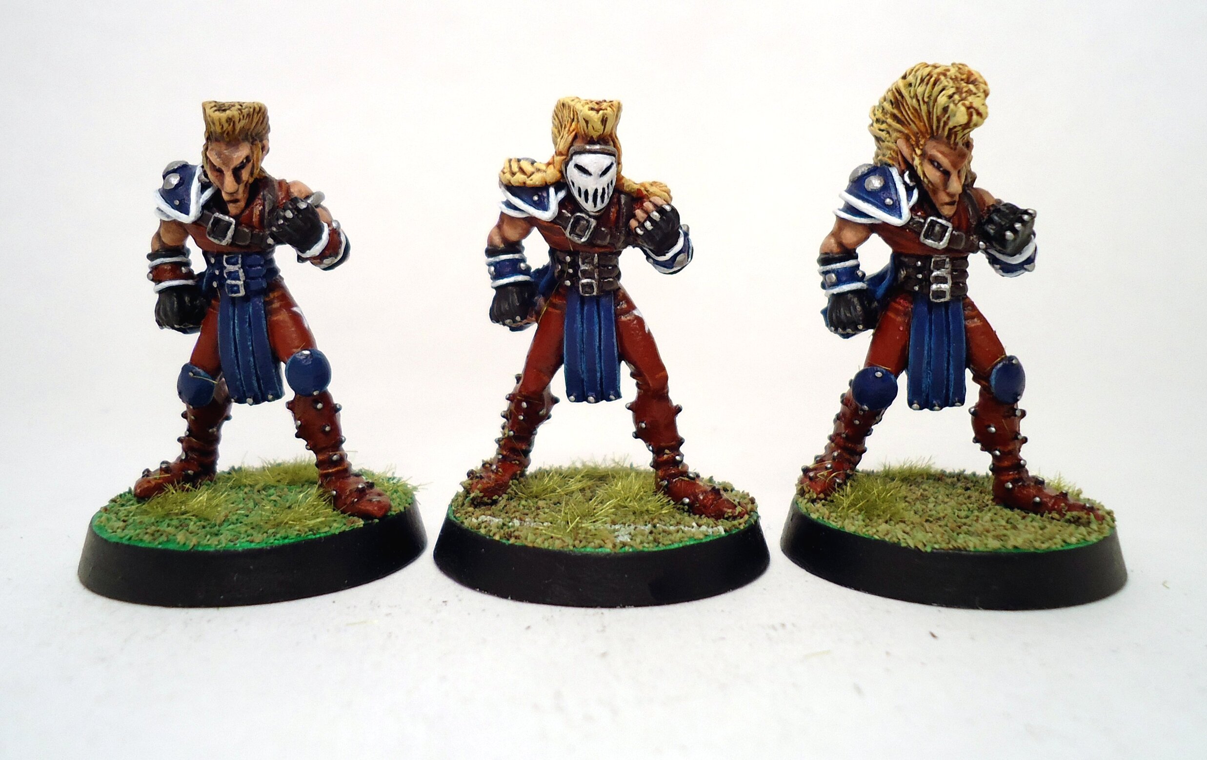
The pro elfs were painted in mainly red and blue with silver for the metal parts and small areas of white to brighten them up. Again white and silver are similar colours and used in moderation.
Skin, hair, fur, scales, etc
An important factor to take into consideration is what colours the “natural” parts of your model will be. In some cases, the player will be completely enclosed (Dwarf Blockers) whilst in others they will only have a shoulder pad and loin cloth with bare skin (beastmen) and fur/hair/scales making up the majority of the colours used.
The Bloodbowl world is a magical and bizarre place so you could have a human team from the Empire that is all Caucasian with some differences in hair colour, Black players from the Southlands, Asian from Cathay, even bright blue skin due to face paint, tattoos or through some other magical means, you can even have a mixture if you so desire. That doesn’t even get into the many colours teams like lizardmen or the followers of chaos can be.
Before you pick the team strip consider what the colours the “natural” parts of the models will be. Mid green armour might work great for wood elves, but will be very close to the skin colour of an Orc team.
You can also incorporate team colours into the skin, hair, scales etc by giving players tattoos/bodypaint or hair dye. This helps greatly with low armour teams such as Norse.
Warhammer dark elves usually have pale skin, but other fantasy dark elves are often depicted with grey instead. They were also given red clothing as a change from the more common purple.
GW have never produced slann Blood Bowl models and their original fantasy range was done a long time ago, meaning the models are hard to get and not all that well made. This team was an attempt to update them using existing GW plastics.
A key aim was to make a team where it was easy to tell the 3 positional players apart. This was mainly done through using different models for each as well as varying their armour and equipment. A small addition to this was to vary their skin tone so the blitzers were darker and the catchers lighter shades of green.
Another option would have been to drastically alter their skin tones or add body paint, but this would have made it tricky to match them with their strip of red, yellow and silver.
Bringing a team together
In some cases, teams are not all one type of creature or wear vastly different amounts of armour, Chaos Warriors compared to Beastmen are case in point, with Undead, Chaos Dwarfs and Lizardmen being other prime examples. In these instances, you will often have players that look very different from each other and wear considerably different amounts of armour making it is even more important that they have an easily identifiable uniform.
In these cases think about what you can do to help unify the players, it could be deliberately giving them all similar hair colours or ensuring all their accessories are the same colour. Conversely if the team is made up of the same race then altering the colours of some of the non-uniform parts can be done to help differentiate between the positions.
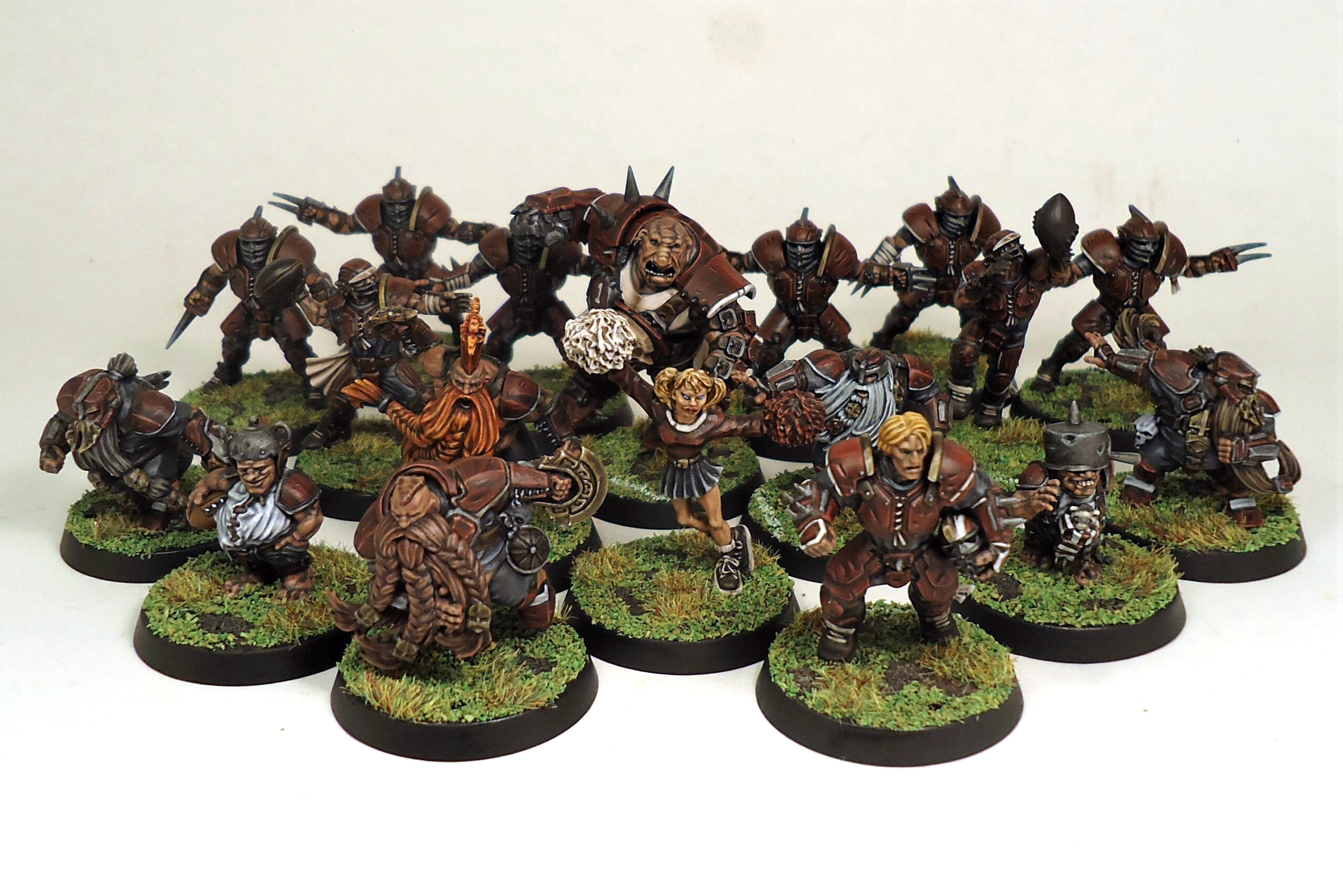
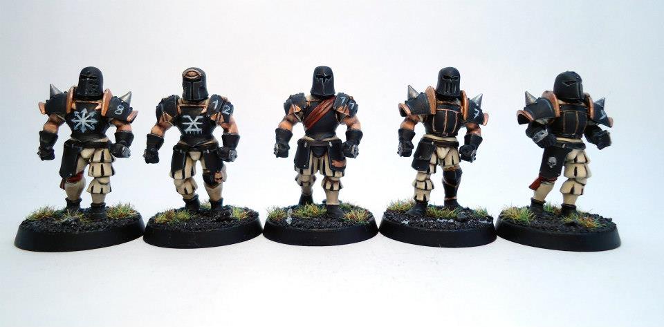
The Old World Alliance team contains, humans, Dwarfs, Haflings and an Ogre. The strong colour scheme of deep red, grey, silver and white, helps unite some very different looking models.
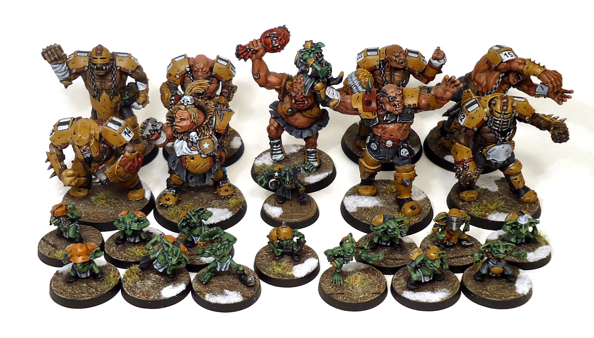
There is a stark difference between both the size and appearance of the ogres and Gnoblars. Using the same limited pallete of colours for their clothing and equipment helps tie them together as a team.
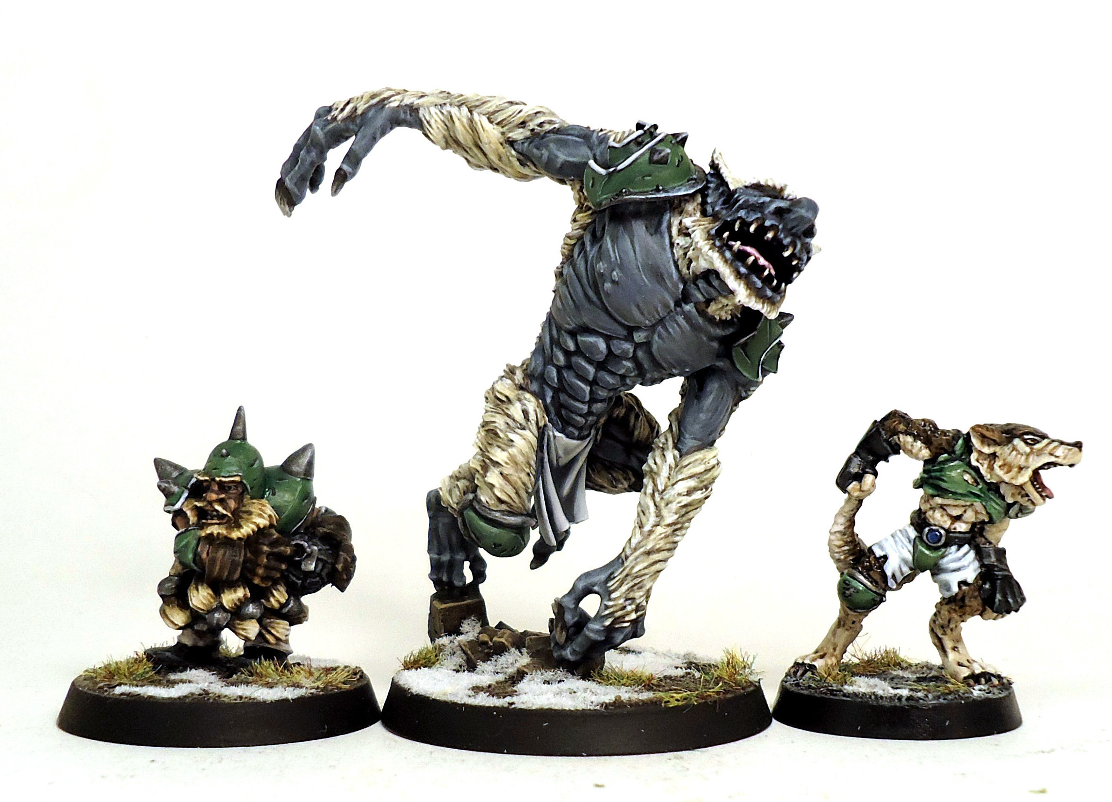
All 3 star players are painted in the colours of the same norse team. Despite being very different in equipment and appearance I chose colouring that would match their uniform of white green and silver. All have a more yellow than grey hair/fur colouring to differ from the grey shaded white of their uniform and the snow on their bases.
Breaking the rules
Bloodbowl players are well known for flagrantly breaking the rules, so there is no need to stick rigidly to the guide above when painting them either. Below are a couple of examples that did not follow the colour/shade/metal process.
These savage orcs show how colouring can be used in addition to conversions to differentiate positionals from each other. The models have little in the way of uniform and are mostly flesh or natural items such as bone or brown leather so they only have 2 team uniform colours, yellow and silver, they do all have red tattoos so this is sort of the 3rd team colour. I used the classic positional colouring (green for blockers, red for blitzers, grey for linemen, white for throwers and yellow for catchers) to subtly indicate the differences. The animal skins of the linemen have grey fur or scales whilst the blitzers have red and they all have red topknots too. These colours were kept consistent on their base numbers to further emphasise this.
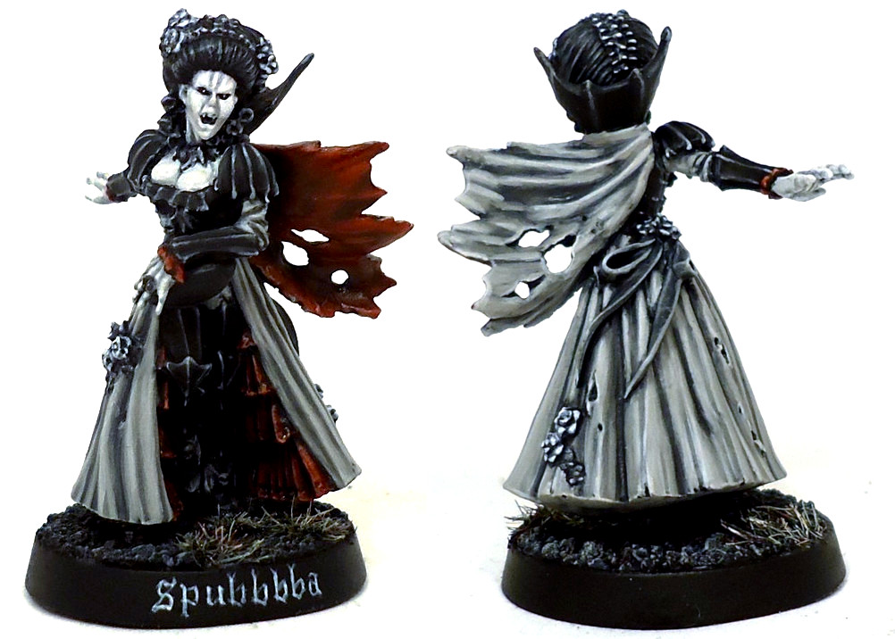
Countess Lucia von Drakenborg, breaks the rules in more ways than one. Not only is she a gender swapped conversion of the star player, but she’s also painted in greyscale. The only exception being the red inner lining of her cloak and dress. Even the metal parts of her jewellery are painted in the NMM style with grey being used to simulate silver.
Conclusion
This is a far from exhaustive list and is really just trying to help kickstart ideas. For further reading you can look at things like colour theory, complimentary and contracting colours, focal areas and many others. There are plenty of sites that cover these in general or how they relate to miniatures directly.
Nice read and a (very valid I’ll add) old school approach, reminds me a lot of the painting blogs I got started with ca. 2012.
Thanks for this guide. Puts some focus on painting BB minis.